Thursday 16 January 2020

Developing Character - Lucy (Impresario)

This week I began drawing up the potential styles for Lucy. For this character i've been asked to use Eloise's design for Lucy in the present as a base and change the style to fit the 1920's flashback sequence.

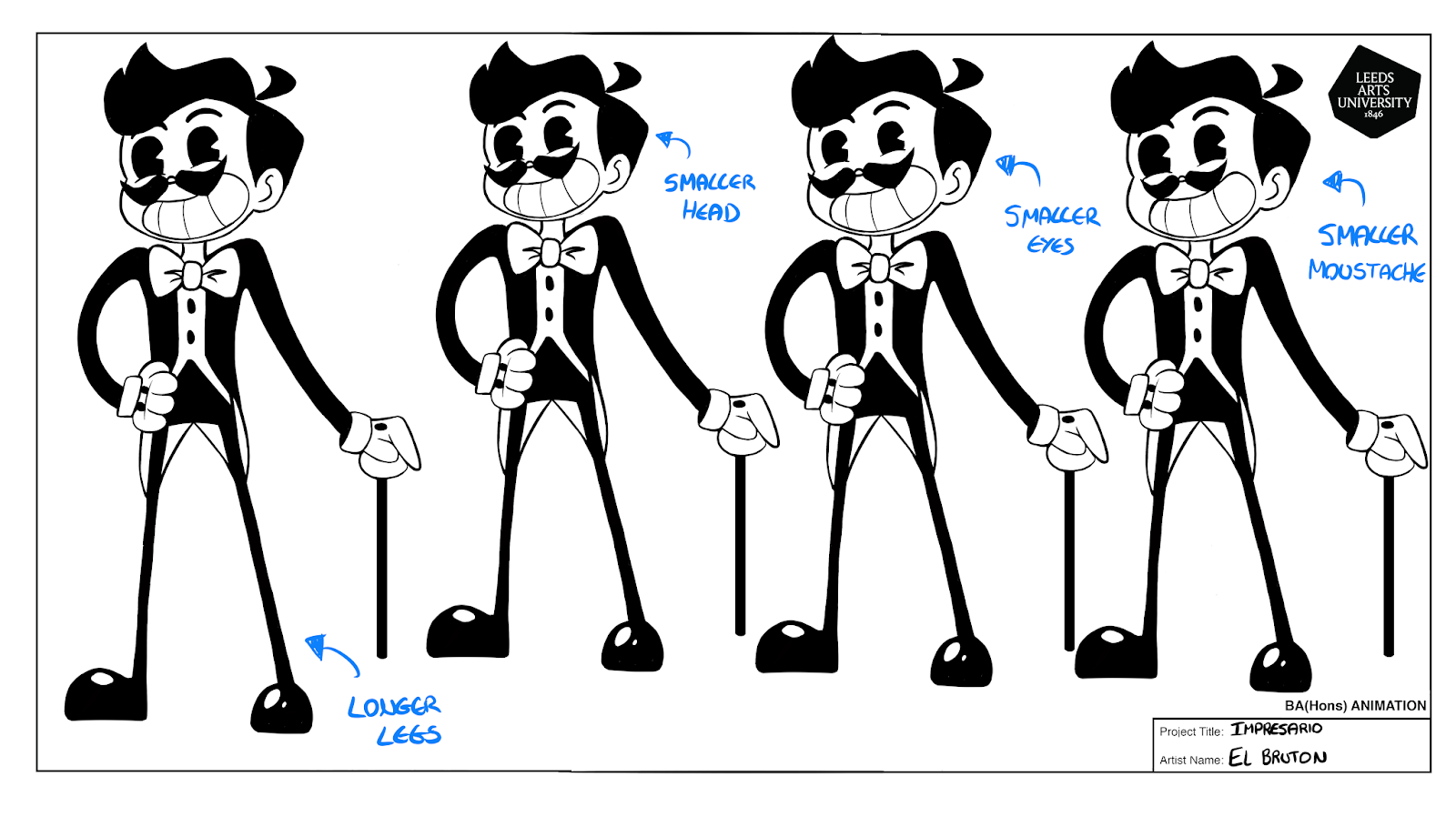
Not knowing the colour schemes for the backgrounds I drew up a few versions with varying tones to test the design.

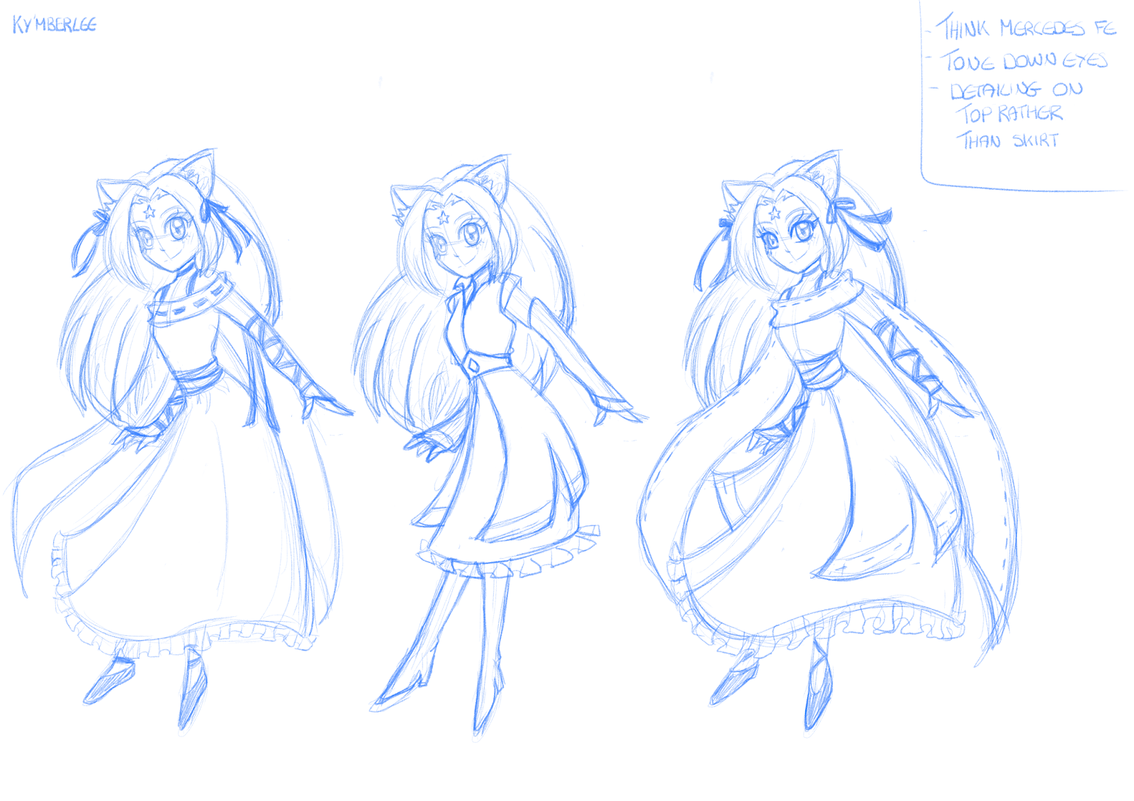
Devon gave feedback saying they liked the design that used varying tones for the shirt and shorts (design 2), and to try giving her eyes an outlines/whites. Due to her being next to the Impresario, her design can afford to be a little less rigid to the 1920's style but the overall stylisation is good.

A colour palette for the backgrounds has now been uploaded so I will be testing this with her improved designs next.

Finalising Character - Ky'mberlee (WRPDAD)

Here is the finalised design and colour scheme for Ky'mberlee the Cat Goddess.

- Vibrant green hair to make it stand out and give her a more alien appearance, with yellow ribbons to compliment this.
- Focused on blues that gave her a soft yet regal feel rather than more intense colours.
- Yellow make-up around her eyes to make them stand out.
- Orange eyes to stand out.
- Hair looks long and thick with a strong and smooth structure
- Overall very light and flowy design to give the impression of an etherial being.

As this designed has been cleared I can now move forward with creating the turn around, and begin work on the other humanoid character, Jazz.

Initial Sketches - Ky'mberlee (WRPDAD)

Here I have been working on the initial sketches for the Cat Goddess (Ky'mberlee). Because she is part of the backgrounds I was asked to prioritise her and the other humanoid character (Jazz), so I have been mostly focusing on her over the protagonists.

- Designed to look like a marketable mid 2000's anime girl with the classic long straight hair, middle parting bangs and big eyes.
- Initially struggled finding a focus for her outfit as it had to be very anime while looking vaguely alien but still human.
- Tested designs that had a more magical girl vibe or youthful feel but these didn't work with her character.
-Decided to focus on using a longer dress with layers to give her the princess/goddess vibes we were looking for.
- Keeping the patterns fairly simple as to not make her look too out of place.

Finalising Character - Balthazar (Impresario)

This is the final edits board for Balthazar that has the changes Devon asked for in a few variations.

They really liked the slimmer waist and longer legs and chose the third design overall. The final change they asked for was to make the cane longer to make him appear taller overall.

The design at the bottom is the final design with all the changes made and has been approved by Devon. If any further changes are to be made it will be to do with the colour palette so I can move on to creating his turn around.

Developing Character - Balthazar (Impresario)

Here I worked on developing the initial sketches for Balthazar using the notes I received from the previous group meeting.

I created a few variations of the original design to test different features and different sizes. Devon decided that they preferred the options that had a longer neck and coat tails, and asked for the head and shoulders to be made smaller (to make the character appear more lanky), and for the legs to be longer and thicker while the waist should be smaller. The facial features were all fine so these don't need further editing.

Initial Sketches - Balthazar (Impresario)

These are my initial sketches for the protagonist Balthazar for Devon's project 'Impresario'. This project uses two styles to communicate a present time and a flashback, and it is the flashback designs that I will be working on. This will be inspired by 1920's animation and have predominantly black and white colour schemes with pops of colour.

We have decided to focus on the style in the top left as we liked the general structure. The main notes were to keep the hair short and pointed (possibly with a hat), keep them looking bendy, avoid having boots (characters legs can just be black), and to add a waist coat.

Initial Sketches - Anderson (WRPDAD)

Here is the initial digital sketches for the protagonist Anderson. This was done to get an idea of how Anderson is drawn digitally and potential colour schemes for him.

We decided that the line style should be more grainy to make it seem more childlike and rough, and that lines shouldn't overlap to improve consistency of style. His overall roundness is good and blues and pinks seem to be the preferred colour palettes but this is not final.

Initial Sketches - Bulubites (WRPDAD)

Here I have been working on initial character designs for Emily's project 'World Ruin, And Prickling Destruction, And Absolute Death'.

These are all rough sketches for the characters known as 'Bulubites' who live in the world the short film is set in. These were mostly to get clarification on what is allowed and isn't allowed for these characters. For example, they have to be generally round-ish and can't wear any accessories that seem to advanced for their species. So leaves, flowers, and glasses are allowed but no hats or hair (the Pope-King is an exception to this rule).