This concludes my work on this project. Overall i'm very happy with my contributions to this film and i'm very excited to see the finished product.
Tuesday 19 May 2020
Why The Bear is Stumpy Tailed: Visual Effects
This concludes my work on this project. Overall i'm very happy with my contributions to this film and i'm very excited to see the finished product.
Monday 18 May 2020
Impresario: Clean up
Though I feel that some of the line work isn't as clean as the previous scene I worked on, I feel that a lot of the animation is much smoother. Overall I'm happy with how this scene turned out and working with robber hose like animation was a fun experience.
Next I will be finishing up my scenes for Emma's project and pulling everything together for submission.
Friday 8 May 2020
Why the Bear is Stumpy Tailed: Visual Effects
This week I focused on Emma's project 'Why The Bear is Stumpy Tailed'. For this project I signed up to do some visual effects as this is one of the areas of animation I quite enjoy and feel I have some skill in. I think these two scenes came out really nice and was a good break from character animation.
Next I will be continuing to work on my last Impresario scene as well as continuing with these visual effects scenes.
Monday 27 April 2020
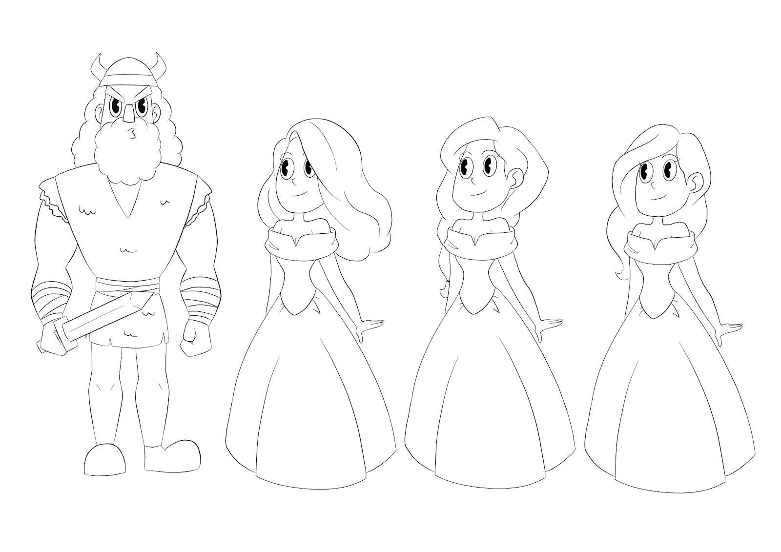
Live Brief 4: Amaraunt & Interim Submission
 I have now completed the 3 characters required for the interim submission date. The final character for this submission was Amaraunt, an elven priest. The client asked for a predominantly light blue and white colour scheme and to give the character long hair.
I decided to give him a soft and gentle feel in contrast with the other two characters, I imagine him to have a positive outlook on life and to act as the healer of the group. His look is very controlled and structured as he comes from a very regulated background.
 The client liked the idea of giving him a cloak so I experimented with a few different styles, basing them off various religious uniforms, but all versions having a longer back then the front. I also experimented with the idea of him having a scarf like cloth wrapped around his waist which the client ended up really liking and was included in the final design.
Overall i'm very happy with how this character turned out and I think that he fits in with the other two well, while still having enough contrast to stand out.


Sunday 26 April 2020
Impresario: Clean Up
This was an interesting scene to work on as it involved perspective with Lucy stepping forwards. I feel like the scene could have been smoother in comparison with some of the other scenes. However, I do believe that the line work on this scene is very clean and consistent and i'm overall happy with how it has turned out.
Next I will be cleaning up another scene that is much longer and contains more characters. This scene will probably take a lot longer and will be done in between me also working on visual effects for Emma's final film.
Saturday 11 April 2020
Live Brief 4: Character Design Challenge


For my final live brief I decided to participate in another character design challenge as they seem to be the most relevant live brief for my industry focus.
This months theme was 'Doctors and Nurses' and I wanted to try and design something that stepped away from my usual style. I wanted to go for a somewhat dark fantasy theme with a cute twist. I chose to create a gothic plague doctor spirit as I felt that I could create an interesting design that would push me out of the box and allow me to practice with some different brushes.
Wednesday 1 April 2020
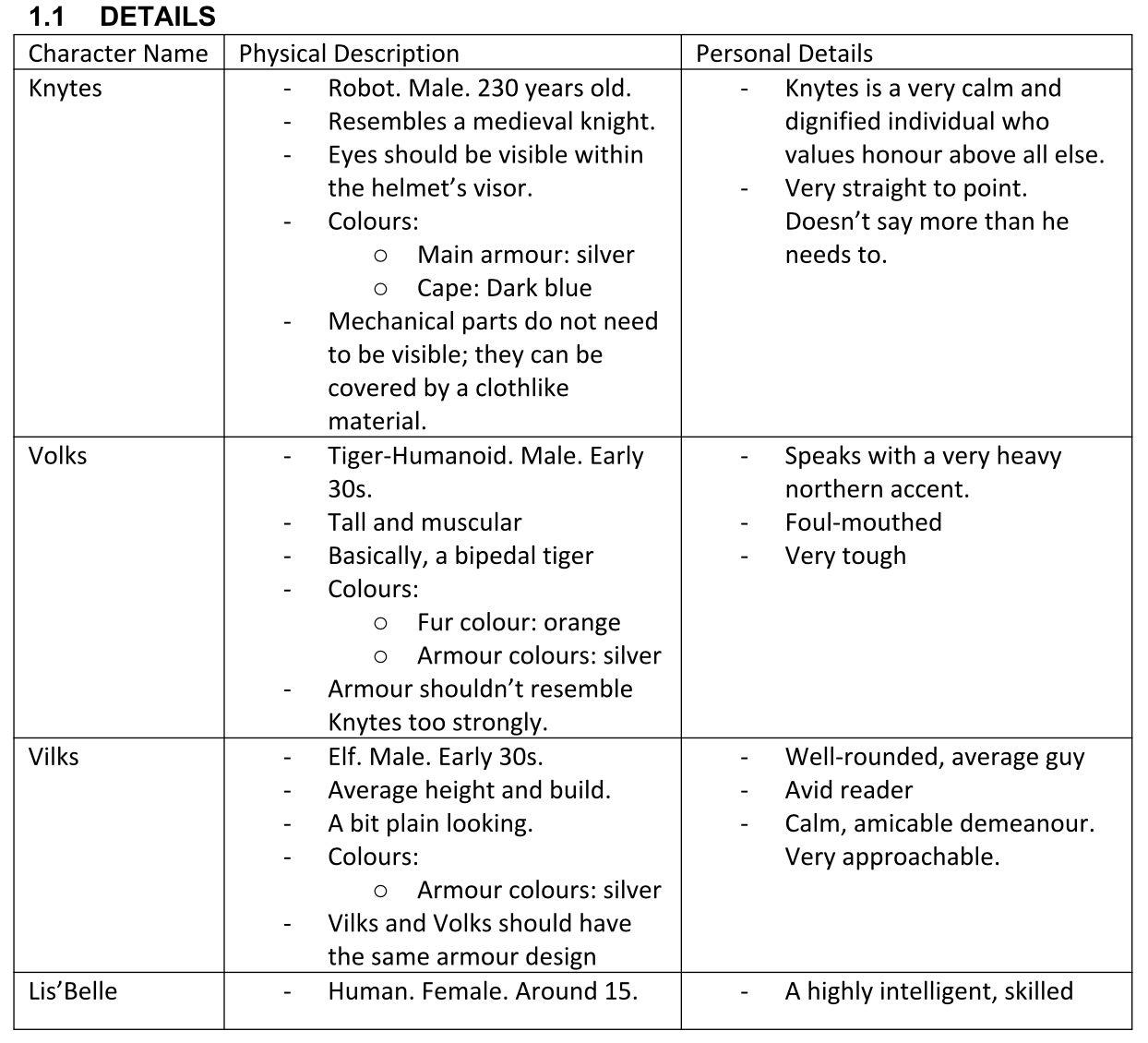
Live Brief 3: Knytes and Lis'Belle


So far I have completed two of the character designs for this brief. The process I have been using for this brief involves creating a set of rough sketches to show off my initial ideas, sending these off to the client who gives feedback, and then moving forward with creating a clean version.
Both of these finished designs have been cleared by the client. So far, progress has been somewhat stagnated as I'm often having to push for the information I need for the designs. However, this seems to be good practice for working in the industry and for clients.
They have also asked for the first 3 characters to be finished by the 1st of May so I will be working to get this done as an interim submission date, as the remaining characters will be given to the client after the deadline for this module.
Knytes is the protagonist of the game and acts as the cool, calm and collected leader. He's a robot who values honour above all else and never says more then is needed, he's very straight to the point.

As such his design is very structured and pointed to match his personality. He uses a silver and blue colour scheme with vibrant blue highlights to act as accent colours. I also had to make sure that he didn't have any robotic parts showing, so I chose to use cloth in areas to hide anywhere where skin would normally show.
For Lis'Belle, she is described as a young (around 15) but highly intelligent and skilled magician, but is also exceptionally bratty. She's short tempered and has little respect for authority, but overall her heart is in the right place.

 I liked the idea of parts of her outfit being asymmetrical so created a section of her skirt that uses plaid rather then the usual black fabric, as well as gave her a belted bag that falls on the opposite side. She also has a lot of lace to give it that extra edgy vibe while still being youthful.
Sunday 29 March 2020
Impressario Update
This has meant that any files i've currently worked on have been passed onto someone else to finish while I work on separate scene that I can start on in photoshop.
Here is a video of the progress I made on the lining of one of the scene before I lost access.
For now, the plan is to continue to work to the best of my ability despite the circumstances and get as much of my agreed work done as possible.
Thursday 12 March 2020
Live Brief 3: Request Update
I've had to discuss how much is a reasonable amount of work for me to be doing within the time limit, and we have come to the agreement that my focus will be on getting the main 5 characters done for the deadline (beginning of June).
This was a good experience, as it allowed me to discuss terms and learn how to explain to a client how much is feasibly doable.


Thursday 5 March 2020
Live Brief 3: Character Design for Game Design
 I reached out to a Game Design student and York St John University who needed some character designs completed for his final major project. The game itself is fantasy based RPG and needs character sprites and other content related to the game. I have agreed to design 5 characters plus a few monsters if time permits it.
I feel that this will be a useful experience for me as the main characters are all men which I am less confident in designing, and will help me get used to working to a brief.


Wednesday 4 March 2020
Live Brief 2: 2CUTE2FAIL
 For my second live brief I chose to take part in the Too Cute To Fail challenge on Pictofolio. This challenge involved creating a cute character and posting on the Pictofolio website before the 15th of February.
I successfully completed this challenge ad managed to post my outcome before the deadline. For this submission I chose to use bright and intense colours with lots of pinks, bows and heart motifs, as it was an opportunity to not hold back with creating something overly sweet.
 This was a really fun and insightful challenge that made me aware of the existence of the Pictofolio website which I hope to continue using in the future, as it is a great resource for character design.
Thursday 27 February 2020
Finalising Characters - Extras (Impresario)

- Fairly set colour schemes to match the background with some slight variations.
- Characters in a featured set all have the same colour clothes with variation in the hair and skin tones.


Thursday 20 February 2020
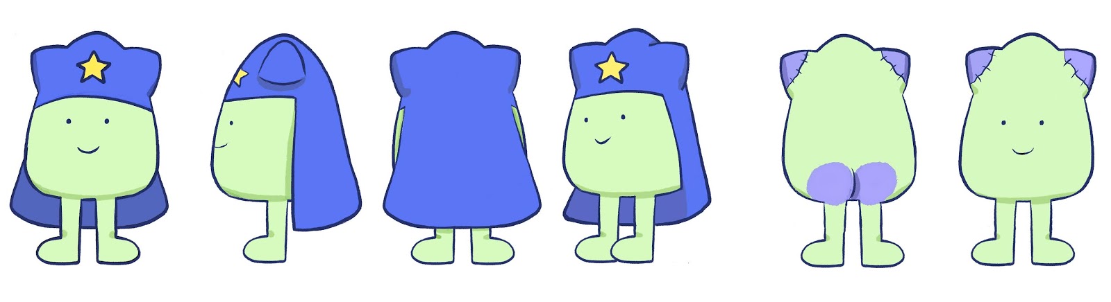
Developing Characters - Extras 2 (Impresario)

- The Valkyries are dancing viking ladies who similarly to the Maidens are a set who share a base design with slight changes to the hair and colours. They wear torso armour and have long flowing skirts. (EDIT: Need 2 more designs as animation now has 5 rather then 3)
- Seigfrieds extra is largely repeated design of Seigfried with changes to the hair, height and colours. He doesn't appear as much as Seigfried but as also a douchey viking.
 - The Orchestra is a cartoon cloud with instruments sticking out of it. It is seen moving across the screen with the Conductor following behind.
Monday 17 February 2020
Developing Characters - Extras (Impresario)
- Rhine Maidens are a set of three who's designs are mostly repeated with slight variations in the hair and colours.
- Siegfried is a Viking in the opera who acts kinda douchey and likes looking at his reflection in his sword.
 -Brunhilde is a Viking lady who has a helmet with wings, a shield and a spear. In the animation we only see her in her underwear. She's very curvy!
- The Understudy has similar features to Brunhilde but ultimately is a man in a corset. His shoulders are wider then Brunhilde and he is shaving his legs in the animation. (EDITS: Give him less leg hair).
- The Conductor is very short but has the confidence of someone 7ft tall. His shapes are fairly pointy.
- The Stagehand has the last amount of screen time and is a young boy in a baker boy hat. He's around the same height of the Conductor despite being much younger.
Wednesday 12 February 2020
Pope King

- Pope King is not as round as Anderson but wears a head piece/cape to show he is a more authoritative/powerful figure within bulabite society.
- To the outside world it looks like he has cat ears and is green (similar to the goddess) but in reality he is not.
 - He paints himself green to appear more like the goddess, but the paint rubs off where he sits and on his ears.
-He initially had more rabbit like ears but cut them off and sewed the tops back on to give the appearance of cat ears.
- He wears a star as a symbol that he worships the goddess.
- He is also the only bulabite to have a butt but he covers I with his cape fo modesty.
Anderson

- Anderson is very round and considered very attractive on his planet.
- Appearance wise he's a bit of an average joe and doesn't have any particular defining features of accessories like other bulabites.
- Though bulabites don't have a concept of gender, Anderson is referred to as a he in the script so I ended up choosing a pastel blue tone to reflect this and to make him stand out.
- It was important for Anderson to have cat ears to reflect the image of the cat goddess, he's almost like the chosen one/ a prophet.
- His simplicity is supposed to be what is appealing about him.
Friday 7 February 2020
Developing Characters - Bulabites (WRPDAD)

The bulubites must be:
-round-ish
-have had two legs (prosthesis ok)
-have ears that vaguely resemble animal ears.
-have eyes in similarly-set places, of a uniform shape and size.
They must not:
-have more than two eyes (one eye, like eye loss due to accidents, circumstances of birth ok)
-have noses
-have arms, hands
-have tails
-Have hair. They are made of putty, and do not bleed
They may:
-wear eyewear (corrective lenses, eyepatches, ok)
-wear headwear (though avoid headgear that looks hat-ish, bow-ish… they might wear flowers, leaves ... bits of cloth just draped on their heads.
-Have droopy ears
These are the set of characters I created based off of these guidelines.
Finalising Character - Jazz (WRPDAD)

- Girlfriend of Ky'mberlee
- Surprisingly plain and somewhat androgynous. - Colours contrast with Ky'mberlee's bright scheme and as such are overall much darker and less saturated.
- Spaceboy t-shirt
- Clothes aren't new or fashionable. Most likely hand-me-downs or bought from a charity shop.
- Supposed to look like a generic anime protagonist that isn't that interesting or stands out too much.
Ky’mberlee Turnaround (WRPDAD)

For characters in this style also decided to create a shading guide as their shading is more complex then the bulabites will be.
Finalising Character - Lucy (Impresario)

Unfortunately, i'm now working behind schedule as I came down with a week long illness that impaired my ability to work effectively. as such i'm going to have to pick up the pace with my work from now on to get back on schedule.
Further Development - Lucy (Impresario)

I also created a board with the improved version of the eyes and with some variations of the skin tone.
I will be asking for feedback on these from Devon and will hopefully be moving onto finalising the design and creating the turnaround.

Further Edits - Balthazar (Impresario)
After beginning the development of Lucy's flashback designs, we decided to make some changes to the Impresario's design, as some of the facial features didn't mix well with her style.
Mainly, we were having issues with the eyes and as such decided to rework them. we wanted to keep the wedge slice highlight, but add an outside line to make them more versatile.
Here is the new finalised design of the Impresario with the edited face and completed turnaround. I definitely feel that this design is an improvement on the previous and will match the other characters designs better.
Thursday 16 January 2020
Developing Character - Lucy (Impresario)

Not knowing the colour schemes for the backgrounds I drew up a few versions with varying tones to test the design.
Devon gave feedback saying they liked the design that used varying tones for the shirt and shorts (design 2), and to try giving her eyes an outlines/whites. Due to her being next to the Impresario, her design can afford to be a little less rigid to the 1920's style but the overall stylisation is good.
A colour palette for the backgrounds has now been uploaded so I will be testing this with her improved designs next.
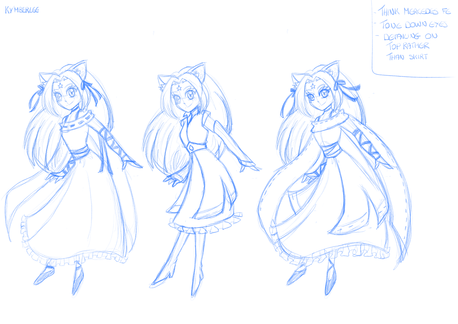
Finalising Character - Ky'mberlee (WRPDAD)

- Vibrant green hair to make it stand out and give her a more alien appearance, with yellow ribbons to compliment this.
- Focused on blues that gave her a soft yet regal feel rather than more intense colours.
- Yellow make-up around her eyes to make them stand out.
- Orange eyes to stand out.
- Hair looks long and thick with a strong and smooth structure
- Overall very light and flowy design to give the impression of an etherial being.
As this designed has been cleared I can now move forward with creating the turn around, and begin work on the other humanoid character, Jazz.
Initial Sketches - Ky'mberlee (WRPDAD)

 - Designed to look like a marketable mid 2000's anime girl with the classic long straight hair, middle parting bangs and big eyes.
- Initially struggled finding a focus for her outfit as it had to be very anime while looking vaguely alien but still human.
- Tested designs that had a more magical girl vibe or youthful feel but these didn't work with her character.
-Decided to focus on using a longer dress with layers to give her the princess/goddess vibes we were looking for.
- Keeping the patterns fairly simple as to not make her look too out of place.
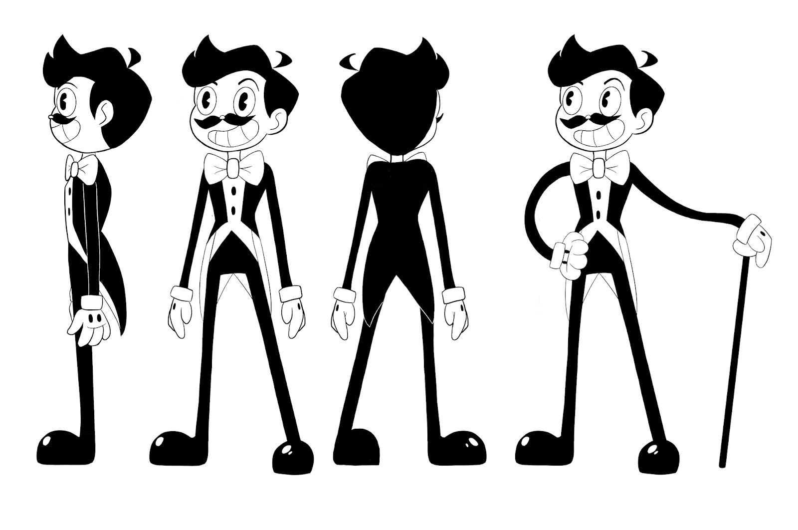
Finalising Character - Balthazar (Impresario)

They really liked the slimmer waist and longer legs and chose the third design overall. The final change they asked for was to make the cane longer to make him appear taller overall.
The design at the bottom is the final design with all the changes made and has been approved by Devon. If any further changes are to be made it will be to do with the colour palette so I can move on to creating his turn around.

Developing Character - Balthazar (Impresario)

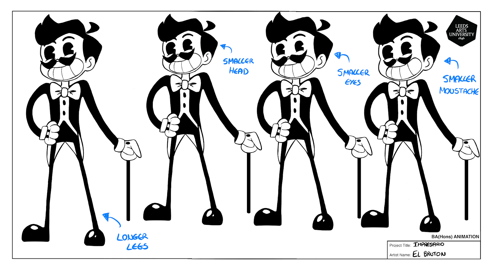 I created a few variations of the original design to test different features and different sizes. Devon decided that they preferred the options that had a longer neck and coat tails, and asked for the head and shoulders to be made smaller (to make the character appear more lanky), and for the legs to be longer and thicker while the waist should be smaller. The facial features were all fine so these don't need further editing.
Initial Sketches - Balthazar (Impresario)

We have decided to focus on the style in the top left as we liked the general structure. The main notes were to keep the hair short and pointed (possibly with a hat), keep them looking bendy, avoid having boots (characters legs can just be black), and to add a waist coat.
Initial Sketches - Anderson (WRPDAD)

We decided that the line style should be more grainy to make it seem more childlike and rough, and that lines shouldn't overlap to improve consistency of style. His overall roundness is good and blues and pinks seem to be the preferred colour palettes but this is not final.
Initial Sketches - Bulubites (WRPDAD)

These are all rough sketches for the characters known as 'Bulubites' who live in the world the short film is set in. These were mostly to get clarification on what is allowed and isn't allowed for these characters. For example, they have to be generally round-ish and can't wear any accessories that seem to advanced for their species. So leaves, flowers, and glasses are allowed but no hats or hair (the Pope-King is an exception to this rule).

Subscribe to:
Posts (Atom)