Thursday, 27 February 2020

Finalising Characters - Extras (Impresario)

Here are the finalised versions of the extra characters fully coloured and shaded.

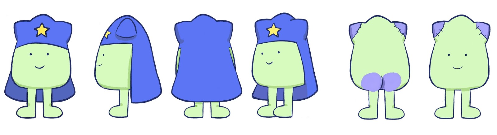
- Fairly set colour schemes to match the background with some slight variations.
- Characters in a featured set all have the same colour clothes with variation in the hair and skin tones.


Thursday, 20 February 2020

Developing Characters - Extras 2 (Impresario)

Here I have been continuing to finish the outlines of the extra characters.

- The Valkyries are dancing viking ladies who similarly to the Maidens are a set who share a base design with slight changes to the hair and colours. They wear torso armour and have long flowing skirts. (EDIT: Need 2 more designs as animation now has 5 rather then 3)
- Seigfrieds extra is largely repeated design of Seigfried with changes to the hair, height and colours. He doesn't appear as much as Seigfried but as also a douchey viking.
- The Orchestra is a cartoon cloud with instruments sticking out of it. It is seen moving across the screen with the Conductor following behind.

Monday, 17 February 2020

Developing Characters - Extras (Impresario)

These are the clean outlined versions of the extra characters for Impresario including Seigfried, The Rhine Maidens, Brunhilde and Understudy, Conductor, and the Stagehand.

- Rhine Maidens are a set of three who's designs are mostly repeated with slight variations in the hair and colours.
- Siegfried is a Viking in the opera who acts kinda douchey and likes looking at his reflection in his sword.
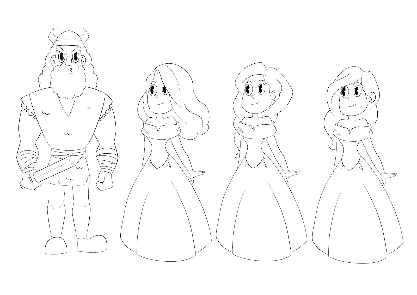
-Brunhilde is a Viking lady who has a helmet with wings, a shield and a spear. In the animation we only see her in her underwear. She's very curvy!
- The Understudy has similar features to Brunhilde but ultimately is a man in a corset. His shoulders are wider then Brunhilde and he is shaving his legs in the animation. (EDITS: Give him less leg hair).
- The Conductor is very short but has the confidence of someone 7ft tall. His shapes are fairly pointy.
- The Stagehand has the last amount of screen time and is a young boy in a baker boy hat. He's around the same height of the Conductor despite being much younger.

Wednesday, 12 February 2020

Pope King

Here is my initial turnaround for the Pope King as well as the final coloured board.

- Pope King is not as round as Anderson but wears a head piece/cape to show he is a more authoritative/powerful figure within bulabite society.
- To the outside world it looks like he has cat ears and is green (similar to the goddess) but in reality he is not.
- He paints himself green to appear more like the goddess, but the paint rubs off where he sits and on his ears.
-He initially had more rabbit like ears but cut them off and sewed the tops back on to give the appearance of cat ears.
- He wears a star as a symbol that he worships the goddess.
- He is also the only bulabite to have a butt but he covers I with his cape fo modesty.

Anderson

Here is the turnaround for the protagonist character Anderson.

- Anderson is very round and considered very attractive on his planet.
- Appearance wise he's a bit of an average joe and doesn't have any particular defining features of accessories like other bulabites.
- Though bulabites don't have a concept of gender, Anderson is referred to as a he in the script so I ended up choosing a pastel blue tone to reflect this and to make him stand out.
- It was important for Anderson to have cat ears to reflect the image of the cat goddess, he's almost like the chosen one/ a prophet.
- His simplicity is supposed to be what is appealing about him.

Friday, 7 February 2020

Developing Characters - Bulabites (WRPDAD)

Here are the finalised designs for the background characters (bulabites).  For these background characters I was given a set of notes as guidelines.

The bulubites must be:
-round-ish
-have had two legs (prosthesis ok)
-have ears that vaguely resemble animal ears.
-have eyes in similarly-set places, of a uniform shape and size.

They must not:

-have more than two eyes (one eye, like eye loss due to accidents, circumstances of birth ok)
-have noses
-have arms, hands
-have tails
-Have hair. They are made of putty, and do not bleed

They may:
-wear eyewear (corrective lenses, eyepatches, ok)
-wear headwear (though avoid headgear that looks hat-ish, bow-ish… they might wear flowers, leaves ... bits of cloth just draped on their heads.
-Have droopy ears

These are the set of characters I created based off of these guidelines.

Finalising Character - Jazz (WRPDAD)

Here I have the finalised design and turnaround for the character Jazz.

- Girlfriend of Ky'mberlee
- Surprisingly plain and somewhat androgynous. - Colours contrast with Ky'mberlee's bright scheme and as such are overall much darker and less saturated.
- Spaceboy t-shirt
- Clothes aren't new or fashionable. Most likely hand-me-downs or bought from a charity shop.
- Supposed to look like a generic anime protagonist that isn't that interesting or stands out too much.


Ky’mberlee Turnaround (WRPDAD)

This week I completed the turnaround for Ky'mberlee for Emily's project. As Ky'mberlee is a static character who will be used for still images she didn't need a four point turnaround and could be more detailed in general. This has helped me catch up on my work as it was one less pose to complete overall.

For characters in this style also decided to create a shading guide as their shading is more complex then the bulabites will be.

Finalising Character - Lucy (Impresario)

This is the final design and turnaround for Lucy. After feedback from Devon we decided to work with colours that matched the backgrounds and to use the new style of eyes.

Unfortunately, i'm now working behind schedule as I came down with a week long illness that impaired my ability to work effectively. as such i'm going to have to pick up the pace with my work from now on to get back on schedule.

Further Development - Lucy (Impresario)

Here are further development boards of Lucy after the initial round of feedback from the group. I used the colour palette I was given by Devon for the background, and tried to incorporate those tones into the design.

I also created a board with the improved version of the eyes and with some variations of the skin tone.

I will be asking for feedback on these from Devon and will hopefully be moving onto finalising the design and creating the turnaround.


Further Edits - Balthazar (Impresario)

After beginning the development of Lucy's flashback designs, we decided to make some changes to the Impresario's design, as some of the facial features didn't mix well with her style.

Mainly, we were having issues with the eyes and as such decided to rework them. we wanted to keep the wedge slice highlight, but add an outside line to make them more versatile.

Here is the new finalised design of the Impresario with the edited face and completed turnaround. I definitely feel that this design is an improvement on the previous and will match the other characters designs better.  

Thursday, 16 January 2020

Developing Character - Lucy (Impresario)

This week I began drawing up the potential styles for Lucy. For this character i've been asked to use Eloise's design for Lucy in the present as a base and change the style to fit the 1920's flashback sequence.

Not knowing the colour schemes for the backgrounds I drew up a few versions with varying tones to test the design.

Devon gave feedback saying they liked the design that used varying tones for the shirt and shorts (design 2), and to try giving her eyes an outlines/whites. Due to her being next to the Impresario, her design can afford to be a little less rigid to the 1920's style but the overall stylisation is good.

A colour palette for the backgrounds has now been uploaded so I will be testing this with her improved designs next.

Finalising Character - Ky'mberlee (WRPDAD)

Here is the finalised design and colour scheme for Ky'mberlee the Cat Goddess.

- Vibrant green hair to make it stand out and give her a more alien appearance, with yellow ribbons to compliment this.
- Focused on blues that gave her a soft yet regal feel rather than more intense colours.
- Yellow make-up around her eyes to make them stand out.
- Orange eyes to stand out.
- Hair looks long and thick with a strong and smooth structure
- Overall very light and flowy design to give the impression of an etherial being.

As this designed has been cleared I can now move forward with creating the turn around, and begin work on the other humanoid character, Jazz.

Initial Sketches - Ky'mberlee (WRPDAD)

Here I have been working on the initial sketches for the Cat Goddess (Ky'mberlee). Because she is part of the backgrounds I was asked to prioritise her and the other humanoid character (Jazz), so I have been mostly focusing on her over the protagonists.

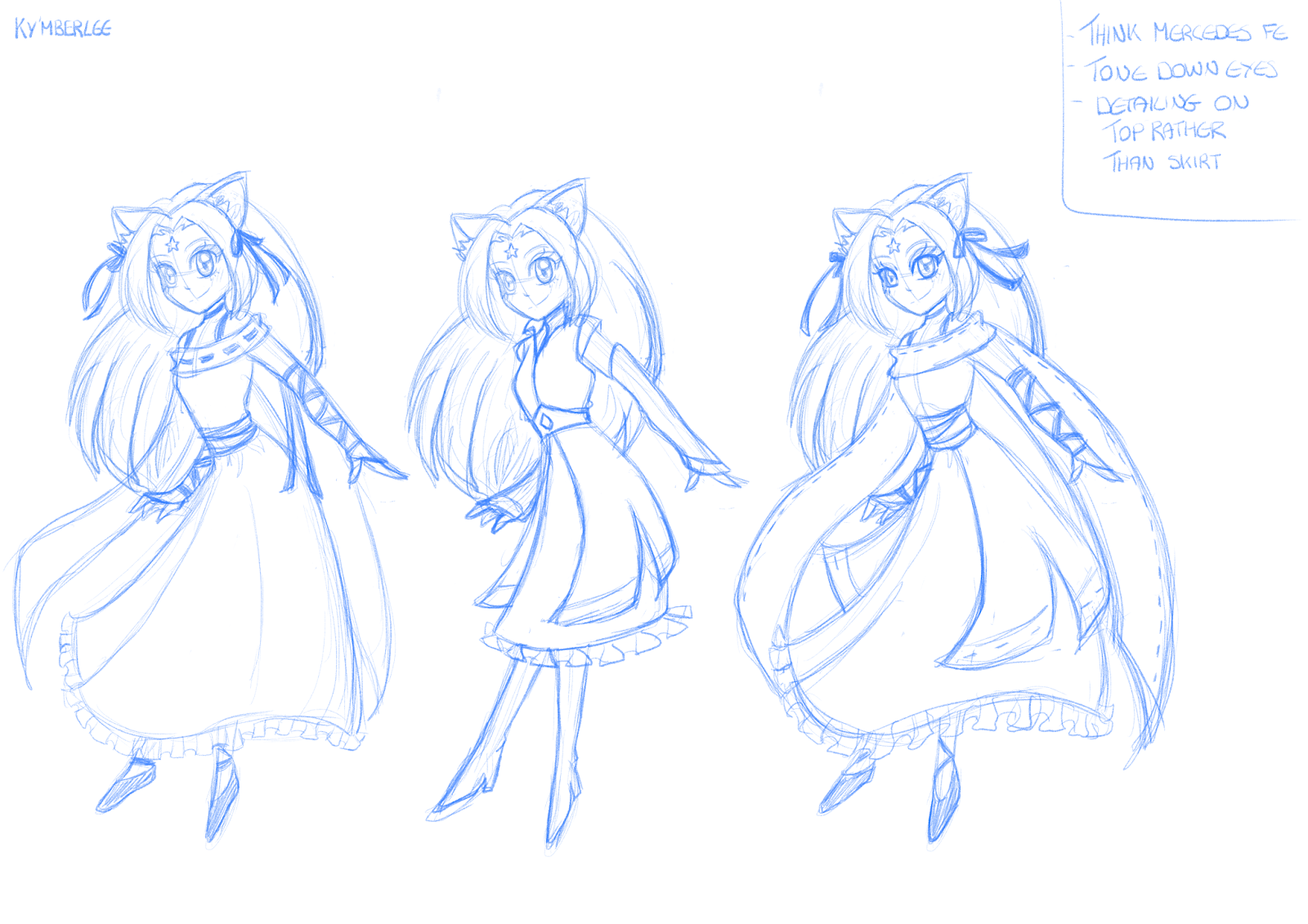
- Designed to look like a marketable mid 2000's anime girl with the classic long straight hair, middle parting bangs and big eyes.
- Initially struggled finding a focus for her outfit as it had to be very anime while looking vaguely alien but still human.
- Tested designs that had a more magical girl vibe or youthful feel but these didn't work with her character.
-Decided to focus on using a longer dress with layers to give her the princess/goddess vibes we were looking for.
- Keeping the patterns fairly simple as to not make her look too out of place.

Finalising Character - Balthazar (Impresario)

This is the final edits board for Balthazar that has the changes Devon asked for in a few variations.

They really liked the slimmer waist and longer legs and chose the third design overall. The final change they asked for was to make the cane longer to make him appear taller overall.

The design at the bottom is the final design with all the changes made and has been approved by Devon. If any further changes are to be made it will be to do with the colour palette so I can move on to creating his turn around.

Developing Character - Balthazar (Impresario)

Here I worked on developing the initial sketches for Balthazar using the notes I received from the previous group meeting.

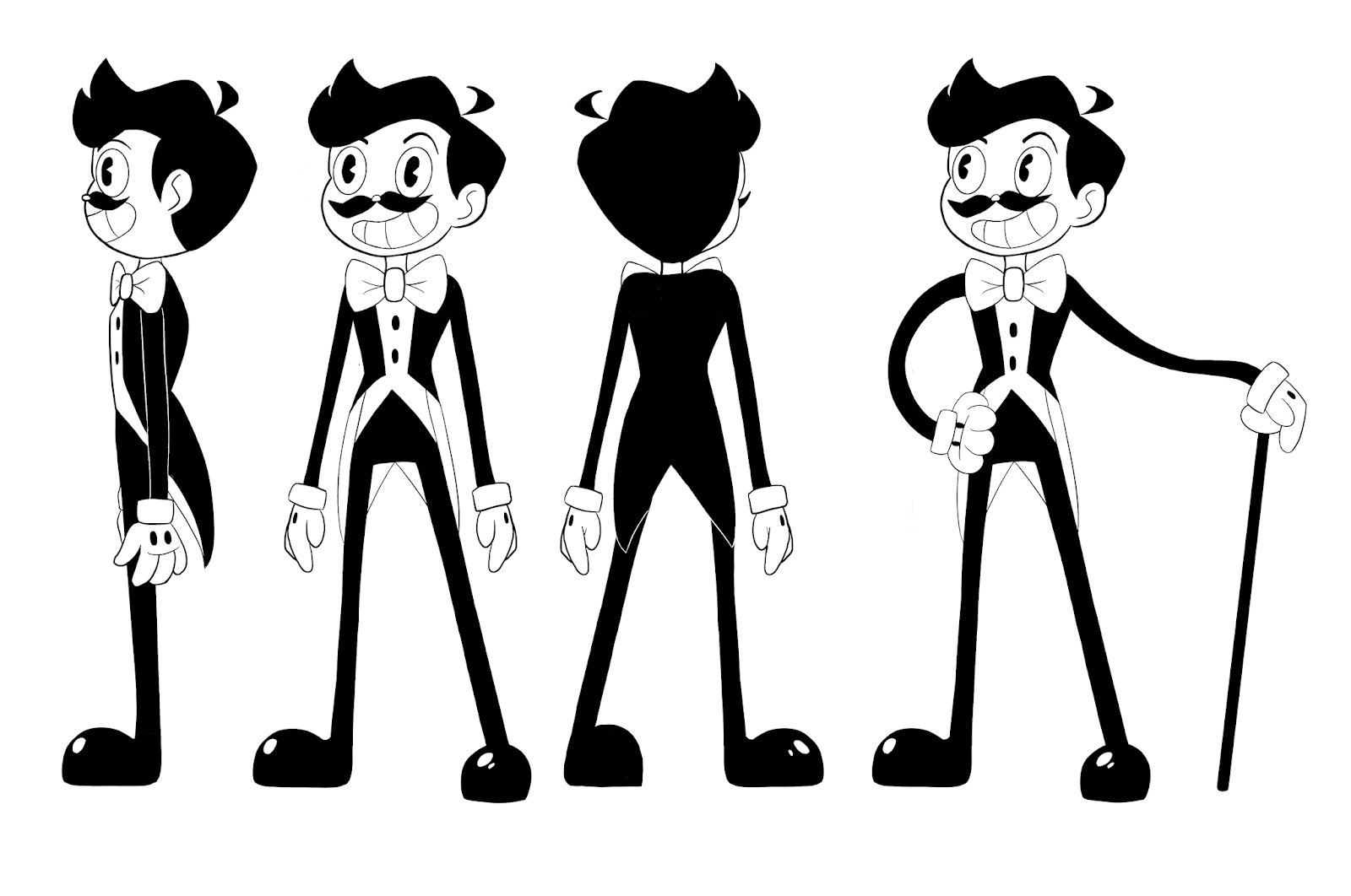
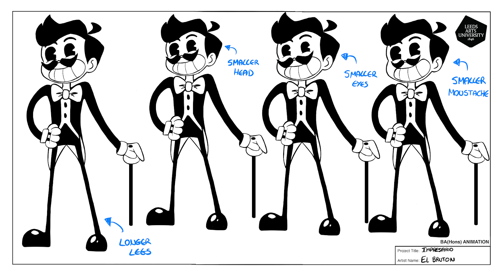
I created a few variations of the original design to test different features and different sizes. Devon decided that they preferred the options that had a longer neck and coat tails, and asked for the head and shoulders to be made smaller (to make the character appear more lanky), and for the legs to be longer and thicker while the waist should be smaller. The facial features were all fine so these don't need further editing.

Initial Sketches - Balthazar (Impresario)

These are my initial sketches for the protagonist Balthazar for Devon's project 'Impresario'. This project uses two styles to communicate a present time and a flashback, and it is the flashback designs that I will be working on. This will be inspired by 1920's animation and have predominantly black and white colour schemes with pops of colour.

We have decided to focus on the style in the top left as we liked the general structure. The main notes were to keep the hair short and pointed (possibly with a hat), keep them looking bendy, avoid having boots (characters legs can just be black), and to add a waist coat.

Initial Sketches - Anderson (WRPDAD)

Here is the initial digital sketches for the protagonist Anderson. This was done to get an idea of how Anderson is drawn digitally and potential colour schemes for him.

We decided that the line style should be more grainy to make it seem more childlike and rough, and that lines shouldn't overlap to improve consistency of style. His overall roundness is good and blues and pinks seem to be the preferred colour palettes but this is not final.

Initial Sketches - Bulubites (WRPDAD)

Here I have been working on initial character designs for Emily's project 'World Ruin, And Prickling Destruction, And Absolute Death'.

These are all rough sketches for the characters known as 'Bulubites' who live in the world the short film is set in. These were mostly to get clarification on what is allowed and isn't allowed for these characters. For example, they have to be generally round-ish and can't wear any accessories that seem to advanced for their species. So leaves, flowers, and glasses are allowed but no hats or hair (the Pope-King is an exception to this rule).


Monday, 2 December 2019

Live Brief 1: Character Design Challenge

For my first live brief I completed November's Character Design Challenge with the theme Spirited Away. This was my first time participating in the Character Design Challenge and I was eager to take part in this months challenge since it was based around one of my favourite Studio Ghibli films.

With the most recent Pokemon game (Sword & Shield) being released last month I wanted to incorporate this as it was a recent source of inspiration. As such, I drew Chihiro as a Galar (the region which the new games take place in) trainer as it meant I could incorporate a more sporty style to the character.

This was a really fun brief to take part in and I hope to take part in more of them in the future to further enhance my character designing skills.

Wednesday, 8 May 2019

Week 9 - Final Edits

This week I have been making the final edits for submission. Due to not being happy with the original version, I ended up redrawing and animating the villagers in the village scene. Our team also though this was for the best as the first version looker very rough.

However, due to time constraints I wasn't able to design and draw as many villagers this time around, however I feel that it is better to have improved designs and styles over quantity of characters.

I still found this task in the project very difficult as there were no character designs for me to base the villagers off, and the amount of detail required for such small characters made things complicated to scale correctly. However, I do think that this version is overall better.

Tuesday, 7 May 2019

Week 8 - Animating

This week I have been busy finishing off drawing and animating the rest of my allocated scenes. This was mostly character animation using adobe after effects, and involved using the stroke effect to create the look of different parts of the image painting itself in. I did also test out some background animation to make sure the effect would match the rest of the animation.  

I feel that the art for the boat and fists scene came out particularly well as by this point I was more experienced with the method of using the legacy brushes and then blending to create the water colour effect we wanted. I do however feel that this took a while for me to learn however due to our group not being able to meet up as frequently as we would have liked because of the holidays and other personal complications.

I also initially struggled figuring out how to create a clipping mask, which was necessary due to the water colour effect of the brushes, meaning they were somewhat transparent and required a backing. However, thanks to some help from Dotty I eventually had this technique memorised and was able to do it much quicker and more efficiently. 

Next week will be spent finalising pieces of the animation and compositing everything together ready for submission.


Monday, 29 April 2019

Week 7 - Fact Card

This week i've been working on creating my fact card for the animation. We decided that the creation of the fact cards would be done through after effects as it would allow us to create the pain/stain bleeding effect we were looking for. Tisa also found a useful tutorial online and created a cheat sheet for me and Petra so that everything we did would be using the same technique and hopefully match up.

I was assigned the fact card talking about Operation Searchlight and the Mukti Bahini. On the left is my completed fact card.

I also created a tester card to practice creating the bleeding effect and get used to working with after effects. I felt that this we a really interesting part of the animation to work on as i'm not used to using after effects even though it is incredibly useful so this gave me some more practice. Overall I think this was a successful week for creating the fact card, however I had been hoping to do more but because of the Easter weekend (where I went to visit my family so couldn't work) and recent illness I had to set more time aside for myself then I planned.


Tuesday, 16 April 2019

Week 6 - Animatic

I have now completed the storyboards and animatic and can begin production with the rest of my group. I created an MP4 file for the animatic as well as 2 PDF's for the storyboards (one with large images of the boards and one with smaller images but includes the notes) so that the team has a variety to work from for different needs and purposes.

After showing the finished product to the group they agreed that it was good and would work for what we needed, however some of the perspectives would be different from how they were shown in the animatic (which I knew from the start) as they were just to show what was happening and the timings. Tisa also decided that the speech scenes would be swapped around in the final version as it made more sense after seeing the animatic with the audio for them to be swapped, which we all agreed with.

Next week I will be starting production of my allocated scenes.

Week 5 - Storyboards

This week I have solely been working on constructing storyboards for the documentary brief. I decided to work using storyboard pro, as we have recently been taught how to use the software and I found it really useful and intuitive during this induction. However, this was my first time using it for a project so it did take some getting used to at first.

Once I had played around with it a little I began constructing scenes for the project, making sure to add notes and adjust the timings to match the script as I went along.

Here are some examples of the boards once exported as PDF's.

Next week I will be aiming to finish the boards and animatic so that I can began production properly.

Full Storyboards PDF

Week 4 - Script and Translation

This week our team worked on cutting down the interview (which was initially 45 minutes long) and selecting what we wanted to work with. Initially me, Petra and Tisa met up to go over the interview, which Tisa ha been able to cut down to around 25 minutes (the rest was either repeated information or not specific to what we were looking for). We went through the interview and managed to cut it down to about a minute and a half of information. With this I began brainstorming ideas for the story boards and how they should be structured.

However, after speaking with Dotty it was decided that it would be better to create an animated trailer rather than a short documentary as there was too much information to get through with the time we had. Agreeing with this, me and Tisa went through our cut down version again to reselect the content we wanted to include and discuss how we would structure it now.

We managed to decided on the trailer being around a minute and a half still but with less speech involved so we can have pauses of information and 'fact cards'. Below is the finished script and audio with some suggested visuals included, ready for me to begin storyboarding.

The next couple of weeks I will spend creating a story board and animatic so we can then begin production.

Week 3 - Research

This week I mostly spent collecting research on the Bangladesh Liberation War and the Freedom Fighters. I mainly used Wikipedia and the Bangladesh Genocide Archive for my core points of research as I found them to have a lot of information that seemed to match up with other websites and could be trusted. Here are some of the sides I created for our preproduction presentation with some of the core pieces of information.
 I hope to soon begin work on the storyboards, however this cannot be done until Tisa has completed her translation of the interview so our group can meet and begin selecting which parts we want to use and how we want to structure it.

However, knowing this takes time Tisa has structured this into the schedule and so far, we are on schedule with everything.

Next week we are due to have a team meeting to discuss ideas further and begin working on a scrip with what Tisa has translated so far.


Week 2 - Pitch Perfect

For our second week of this project, we focused on securing our roles within the group, deciding on the type and style of the documentary and preparing for our pitch perfect presentation. I also spent some time researching the liberation war itself to get a better understanding of what it was and how it started.

Overall, we felt that our presentation was well received and people were interested in how our documentary would turn out. The most important feedback we received was that our topic was too broad and we needed to focus in on something more specific. Our team agreed that we would focus specifically on the freedom fighters and the interview we were hoping to get.

We decided that our documentary would be participatory and we would focus on 2D animation, hoping to create something inspired by traditional Bangladesh paintings from around the time, potentially something with a watercolour effect.

Next week I will be focusing on doing more research into the liberation war and freedom fighters to try and narrow down what areas we want to include.


Week 1 - Documentary Breif

For this brief, I decided that wanted to challenge myself more and focus on a part of preproduction that I was less comfortable doing. With this, I made a team with Tisa and Petra who were also hoping to do something different for this project. It was decided that I would focus on storyboards (rather then my usual character design), Tisa would focus on backgrounds and Petra character design.

As for the topic of our documentary, we found it very difficult to pin point exactly what we wanted to do. We had ideas such as looking into Leeds Art University (but it felt too easy), the Yorkshire Ripper (something that had been done in the past) and haunted places in Leeds (but other groups had similar ideas). We also hadn't selected a director at this point as we had all been directors in our previous projects and wanted a break from it. In the end we decided that whoever put forward the best idea for the documentary would act as director. 

In the end we settled on the Bangladesh Freedom Fighters, something we all felt would be interesting to research, and Tisa said she could get us an interview with someone who was a Freedom Fighter. Because this topic had been Tisa's idea, she was made director.

Next we will be finalising our role within the group and preparing for our presentation at the end of the week.

Sunday, 10 March 2019

Compeition Submission

Here is the video we will be submitting to the D&AD competition. As you can see, there are still some parts that require finishing and credits that needed to be added, however these will be done at a later date so that we can all begin work on our new projects.

Overall I'm happy with how this has turned out, and feel that me and my team have created a strong piece that fits the brief. I'm also pleased with how much we managed to get done under the time constraints so not much more has to be finished for final submission.

I also believe that the scene I completed turned out well, and i'm proud of the animation in these scene. I feel that they are smooth and work well with the style I have created.

All in all, I believe that this was a successful project and I thoroughly enjoyed working with my team on it.

Saturday, 9 March 2019

Week 8

I have now completed all of my allocated scenes for the competition brief and complied them together into a single video (as they were consecutive scenes).

Due to time constraints I did have to edit parts of the valentines day scene as to simplify the animation and have it finished on time.

Overall I feel that the birthday scene on a whole turned out how I wanted it, and the animation within it is smooth. I feel that the transition was also successful and shows a good example of squash and stretch.

If I was to redo this I would allocate more time to the valentines day scene, as I didn't anticipate how difficult this scene would be or how long it would take. However, on a whole I am satisfied with the animation I have created.

Friday, 1 March 2019

Week 7

This week I finished the main animation of the birthday scene. There are a few more things within it that need completing, such as the confetti on the floor and layering objects in front of the characters, however due to backgrounds still not being quite complete this will have to be done later.

I feel that the animation has turned out nicely and I especially like the animation of the child blowing out the candles. If there was more time, I would have liked to added more advanced animation to the mother and father, but due to time constraints this has been kept limited.

The week was also spent contacting music composers, looking for someone to create the soundtrack for our animation. We have successfully done this and found a composer to collaborate with who we have met up with and have been exchanging emails with. Early versions of the music are promising and we are excited to hear the final piece.

I have also been facing some personal issues which has meant that my work speed has slowed and I required the help of my team to revaluate the work load in order to spread things out more. As director, I recognise that I should have informed my team about these issues earlier then I did and know for the future to be more honest with my team.

Friday, 22 February 2019

Week 6

This week I completed the animation for the box transition from valentines day to a birthday. I spent some time researching how to best create the effect we were looking for with the confetti while still sticking to the style we were working with. Eventually I decided the best way to do this was to create custom brushes and individual layers to create an overlapping effect. This also helped with offsetting the speed of the confetti so it didn't all fall at the same rate.

I feel that the finished product is effective and looks aesthetically pleasing.

I also began testing the transition to the birthday scene, trying to figure out the timings and the positioning. However because the background for this scene is not yet complete I wasn't able to create the finished transition style and can only test certain elements. 

Next I will be continuing to animate this scene and hopefully starting animation on other scenes.

Saturday, 16 February 2019

Week 5

This week I began testing out some of the animation transitions. Here is an example of this work showing part of the valentines day transition. We decided to use actual gift wrap from John Lewis for these transitions, with both the box and the background being gift wrap we purchased.

I think the animation of the box went really well and has some good squash and stretch, as well as the timings working well.

However, when testing the confetti that we want to have explode out of the box I found this a lot more difficult then expected. The confetti ended up looking unnatural as it all fell at the same time, but creating individual pieces of confetti will take far too much time to animate with the time we have. I plan to do more research into this to find a better solution.

I also created the final planned character board which shows side views of each character. Initially I wanted to create a full turnaround for each but due to time constraints we decided it would be best to just have side views.

Saturday, 9 February 2019

Week 4

This week I continued with the character boards and completed the main board for the father as well as the guide board and heights board.

For the father board I chose a green based colour scheme to contrast well with the other characters colour bases as well as giving him brown hair and a slightly deeper skin tone. However, I have had comments suggesting that perhaps he looks a little too young so I plan on playing with the design a bit to improve this.

The guide board and height board are mainly for use of my group to help them understand the structure of the character and how to draw them as well as their heights in relation to each other. I feel like this will be very useful for my group and will speed up the process of them learning how to draw each character.

Next I will be creating basic turnaround boards for the characters and starting to test animations

Friday, 1 February 2019

Week 3

This week I completed the first two character designs which are the child and the mother. I chose to give each character their own base colour scheme that they stick with throughout the animation. The child has a blue and white scheme while the mum has a yellow and orange scheme. This makes them easily identifiable and gives them all a unique look.

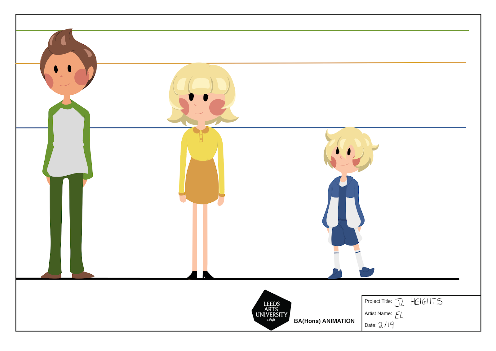
I have also created a basic outline of their structure for my group so it is easier for them to draw these characters. However, to improve this I plan to create a board with all these outlines as well as instructions and tips to go with them.

Next I will be continuing with these boards snd hoping to have the main ones finished by next week.

Friday, 25 January 2019

Week 2

This week I focused on designing the characters for our short animation. We decided on having a family with two parents and a young child. We chose this to help it better relate with our target audience (adults in mid 20s to mid 30s) meaning the child would be fairly young as the parents are still young adults.

I wanted to keep the designs fairly simplistic while still being interesting and individual as we have limited time to create this animation. For this, the characters are built using simple shapes and have basic but appealing features. To improve these designs I want to figure out a way to give them their own individuality and presence within the animation while still having a cohesive look.

Next I plan to finalise these designs and being creating character boards for each of them.

Friday, 18 January 2019

Week 1

For the first week our group focused on selecting a brief, selecting individual roles, coming up with ideas and understanding the brand of our selected brief.

For selecting a brief, we knew we wanted something fairly open, fun and potentially more artistically oriented. After looking through all the potential briefs we decided that the John Lewis and Partners brief best suited this and held the most interest for us. For the roles of the group, I was selected as the groups director and character designer, as I wanted to to try having a more leading role and I have a specific interest in character design. Ava decided to work on storyboards and scripting while Rhys is focusing on backgrounds and other smaller tasks.

To better understand our brief, we decided to visit a local John Lewis department store in the hopes that we could be inspired by their products, clientele, ethos and store branding. We quickly understood that John Lewis focuses on a high end feel, with high quality merchandise and expensive looking interior. We particularly gravitated towards their gifting section as not only was this highlighted in the brief, but we loved the look and variety of the wrapping paper and gift bags. We felt that this could be a really interesting aspect to incorporate into our project.

Finally we had a meeting to discuss initial ideas for the project, with us all agreeing that we really wanted to incorporate time and the seasons to fit in with the idea with 'giving though out the year' as well as the idea of experiences and memories.